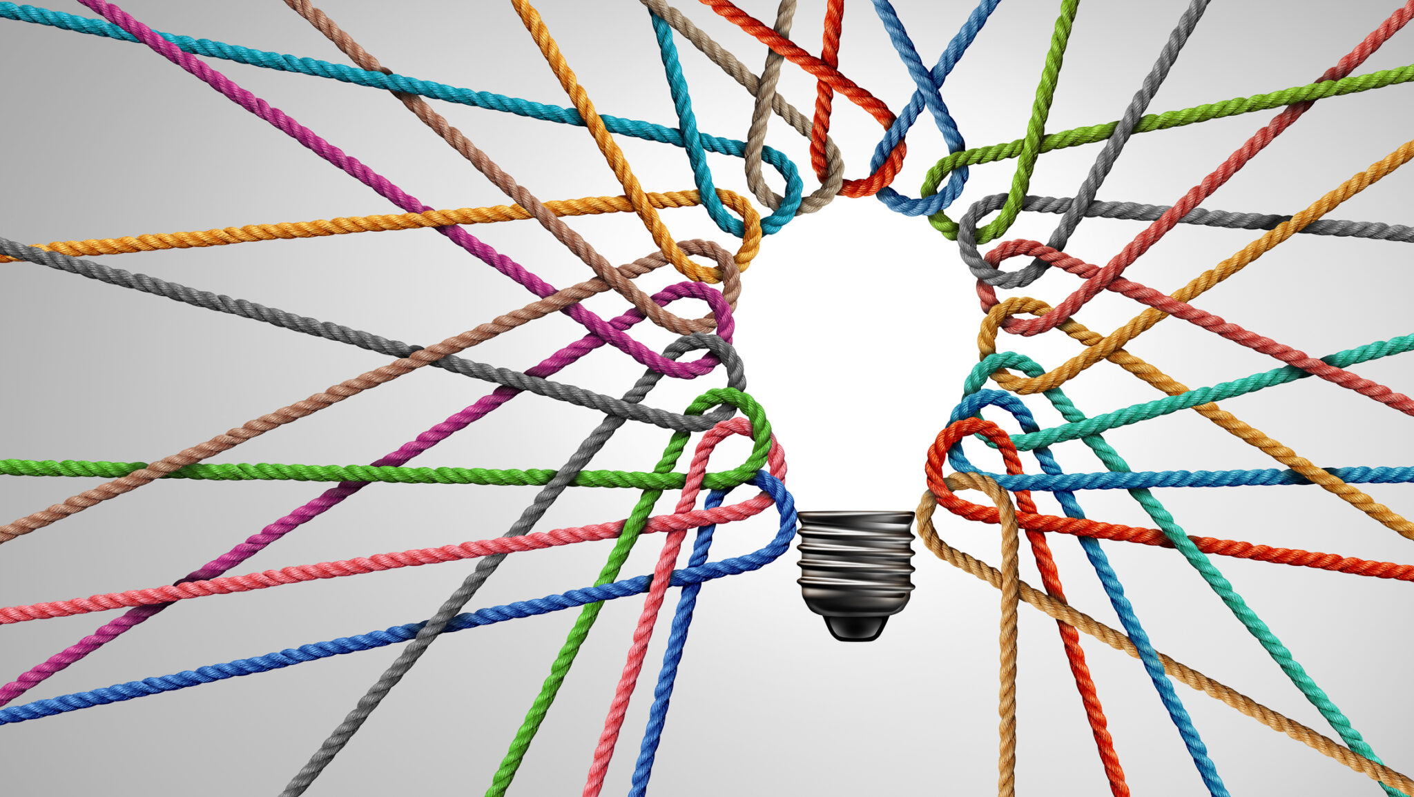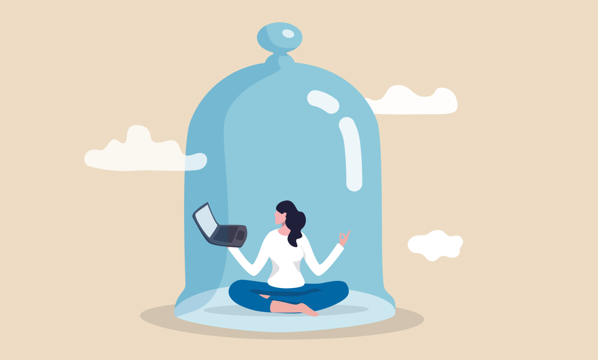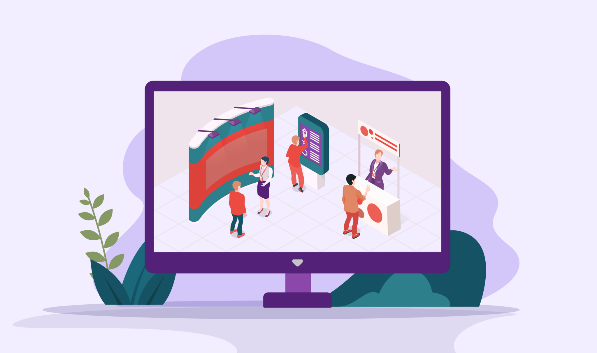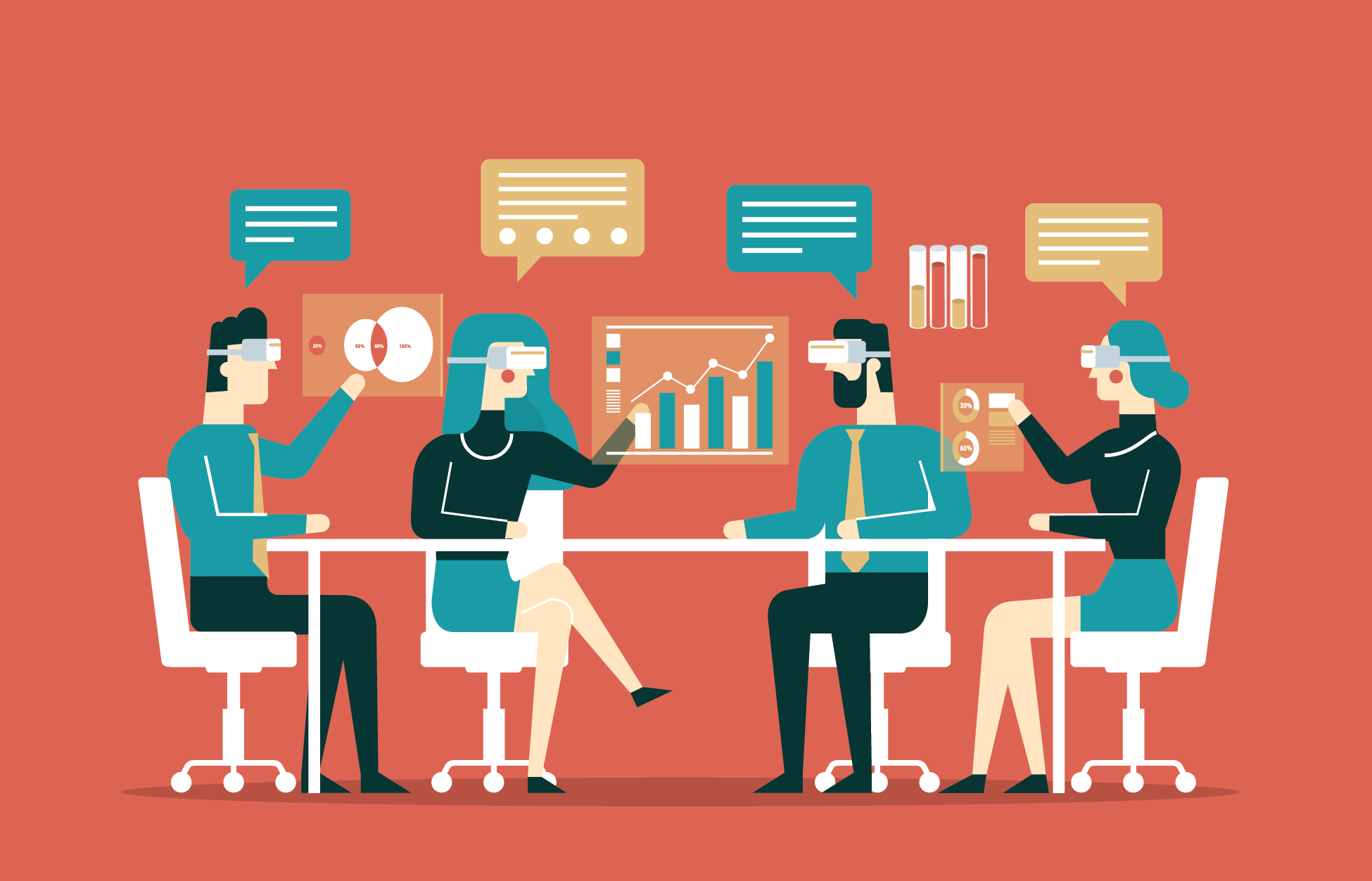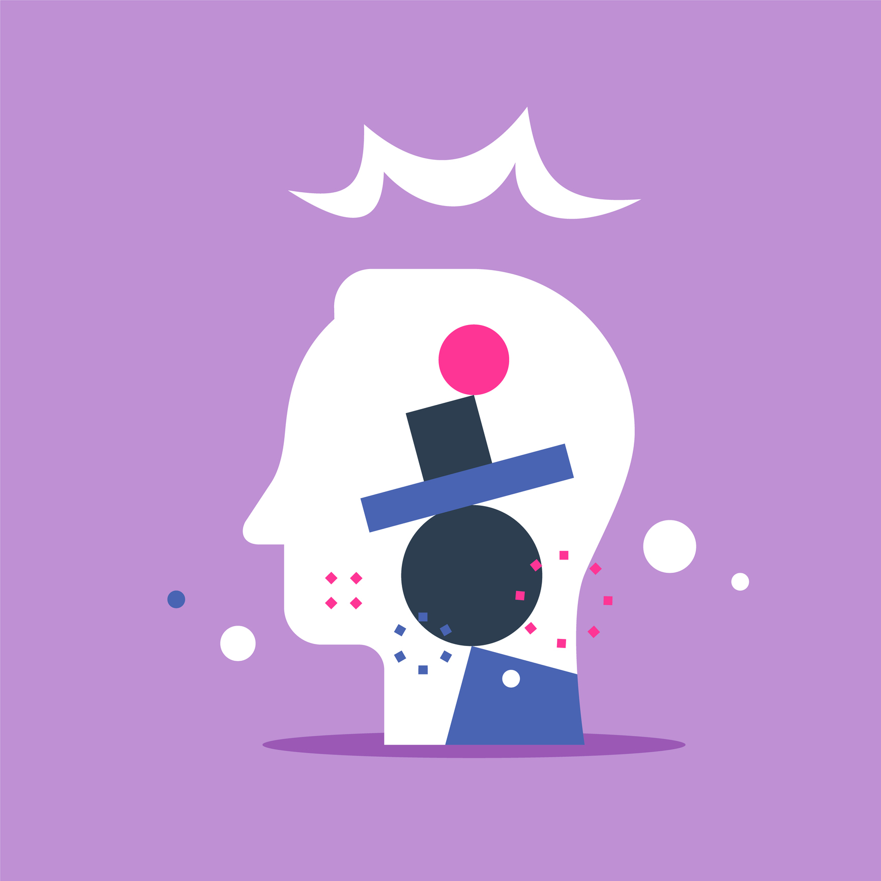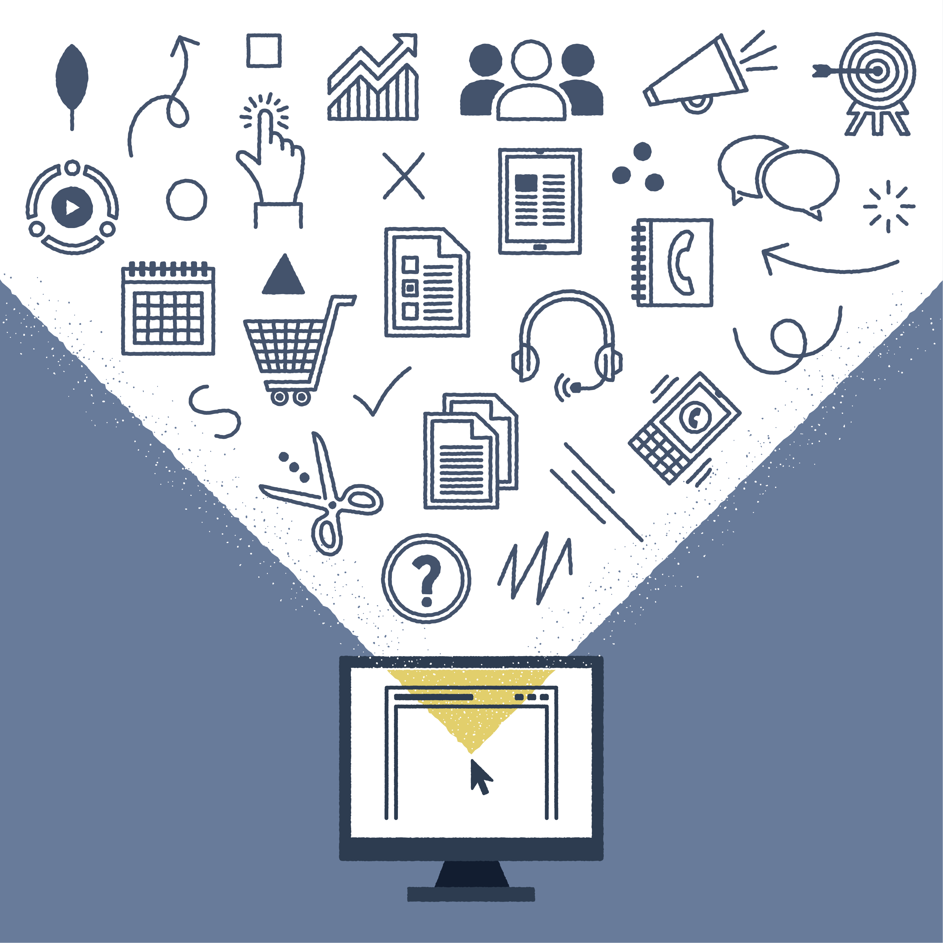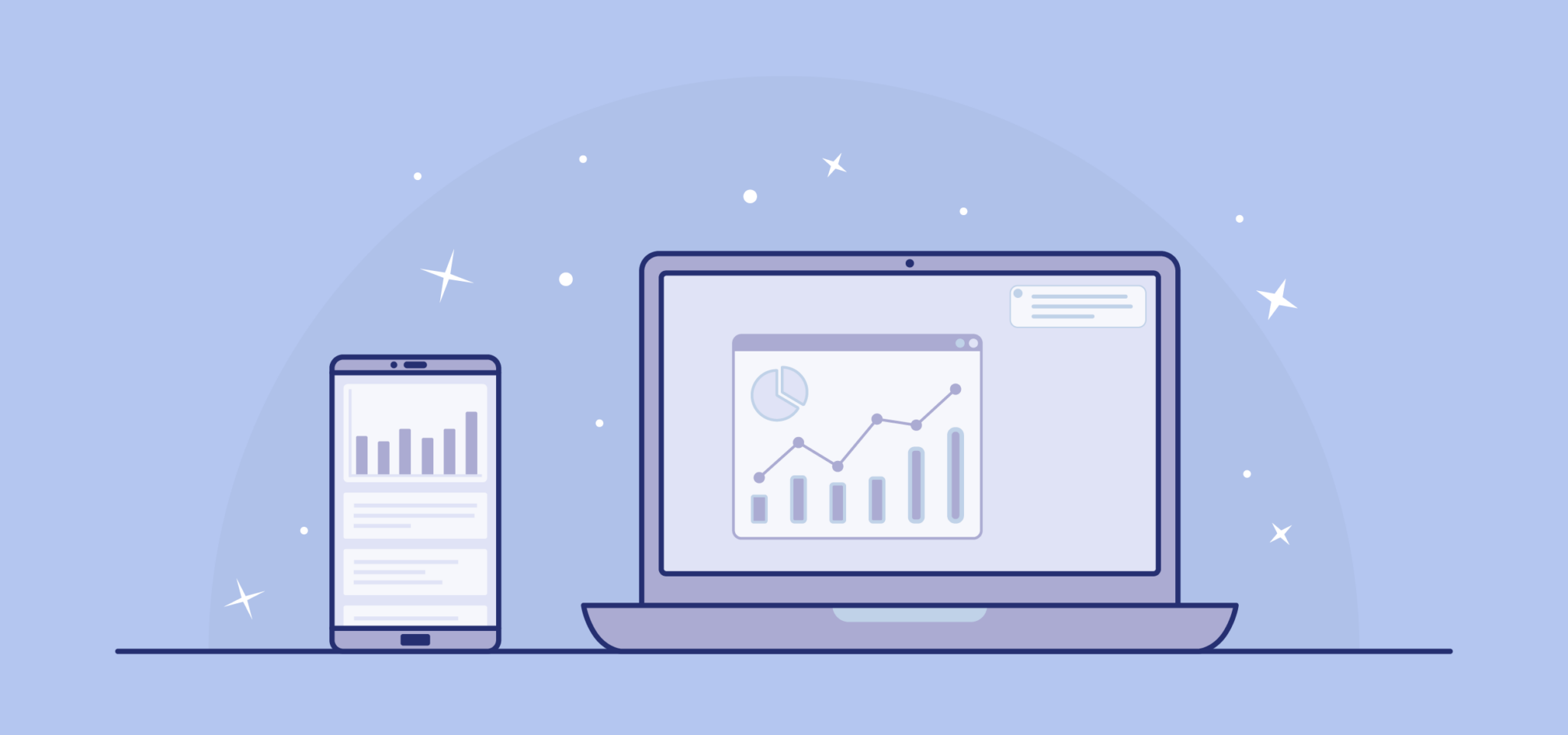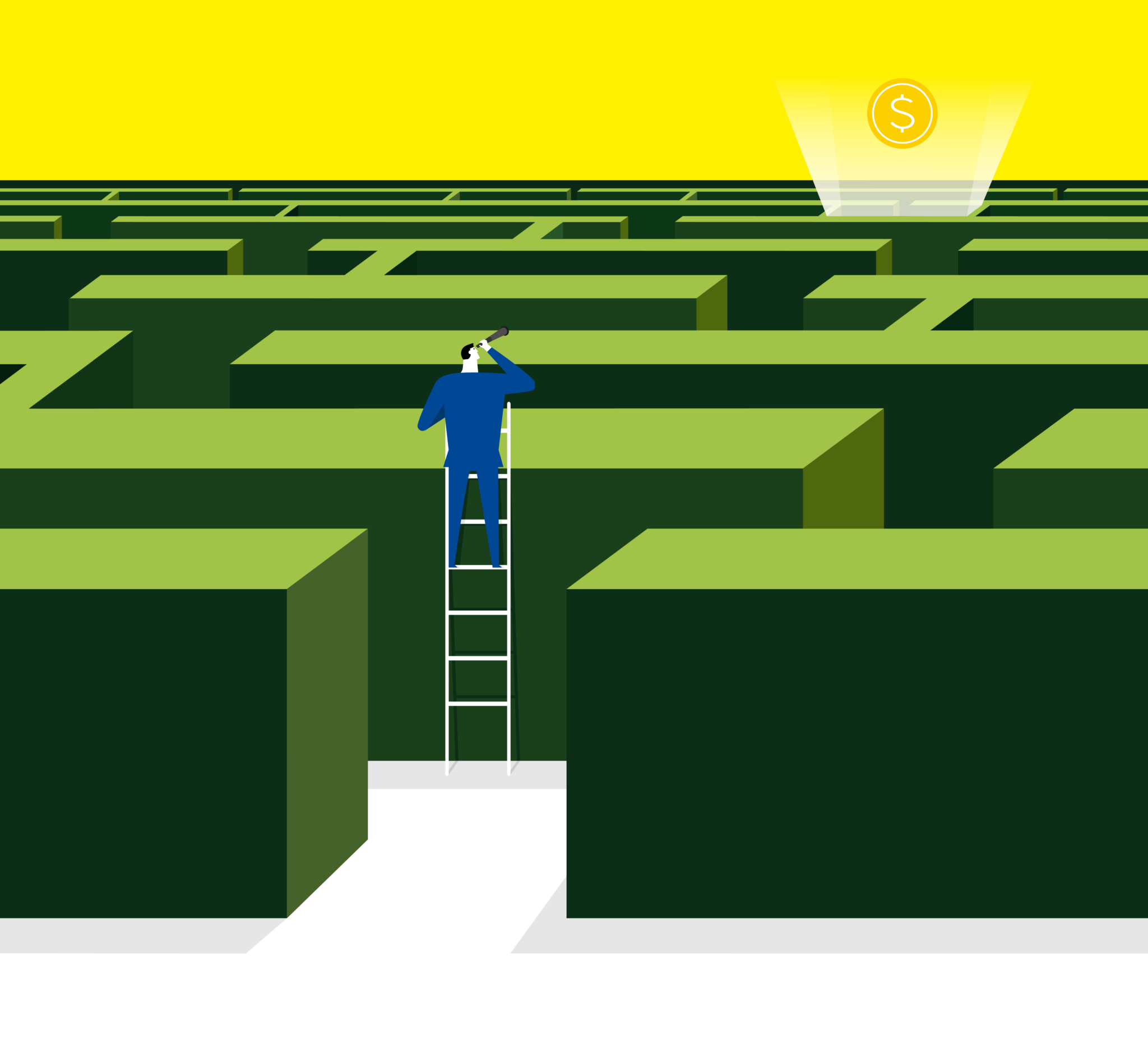

You know an attractive website when you see one: eye-catching photos, popping colors, slideshows and widgets scrolling through, all of the bells and whistles. But is more really better when it comes to your association’s website? Ultimately, the goal of your website is to engage your members and drive sales through dues and other purchases. And while visuals are important to develop in your website (often referred to as User Interface or UI Design), the most efficient way to make sure that your members find what they’re looking for without abandoning their search is by developing your User Experience (UX).
User Experience Design is primarily concerned with how a user interacts with an object to achieve their goals – in this case, your website. Typically, it is a more abstract way of thinking about how all the parts and features of your website (developed through UI Design) interact with each other. UX Design puts the user first and analyzes how they naturally progress through your website as they try to achieve whatever purpose they initially visited for — renewing their membership, checking on upcoming events, interacting with other members, etc. The goal with UX design as an association is to make this process as efficient, friendly, and inviting as possible for your members.
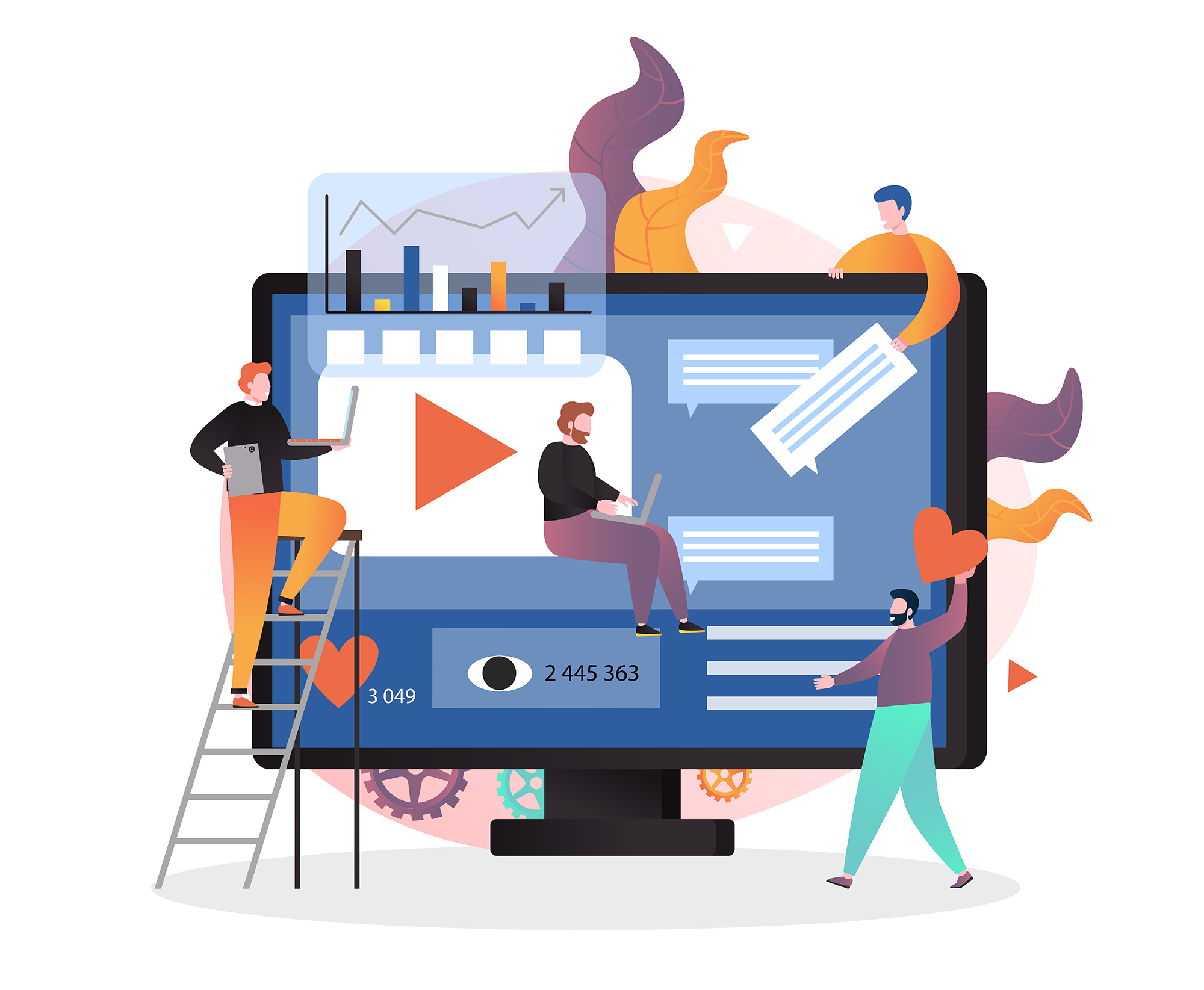
I was able to recently attend a technology conference session titled “10 Human Truths from 3,400 Hours of UX Research Studies” presented by Sandy Marisco, CEO of Sandstorm. In this session, she was able to highlight the importance of conducting and developing UX research. By studying how users interact with your website, you are better able to uncover common goals of your members, identify what kind of content (and in what form) they are looking for, reduce shopping cart or site abandonment, decrease website development costs, and improve overall member engagement. Below are the 10 truths that Sandstorm was able to discover in their research that you should keep in mind when developing your site UX:
Users want everything instantly
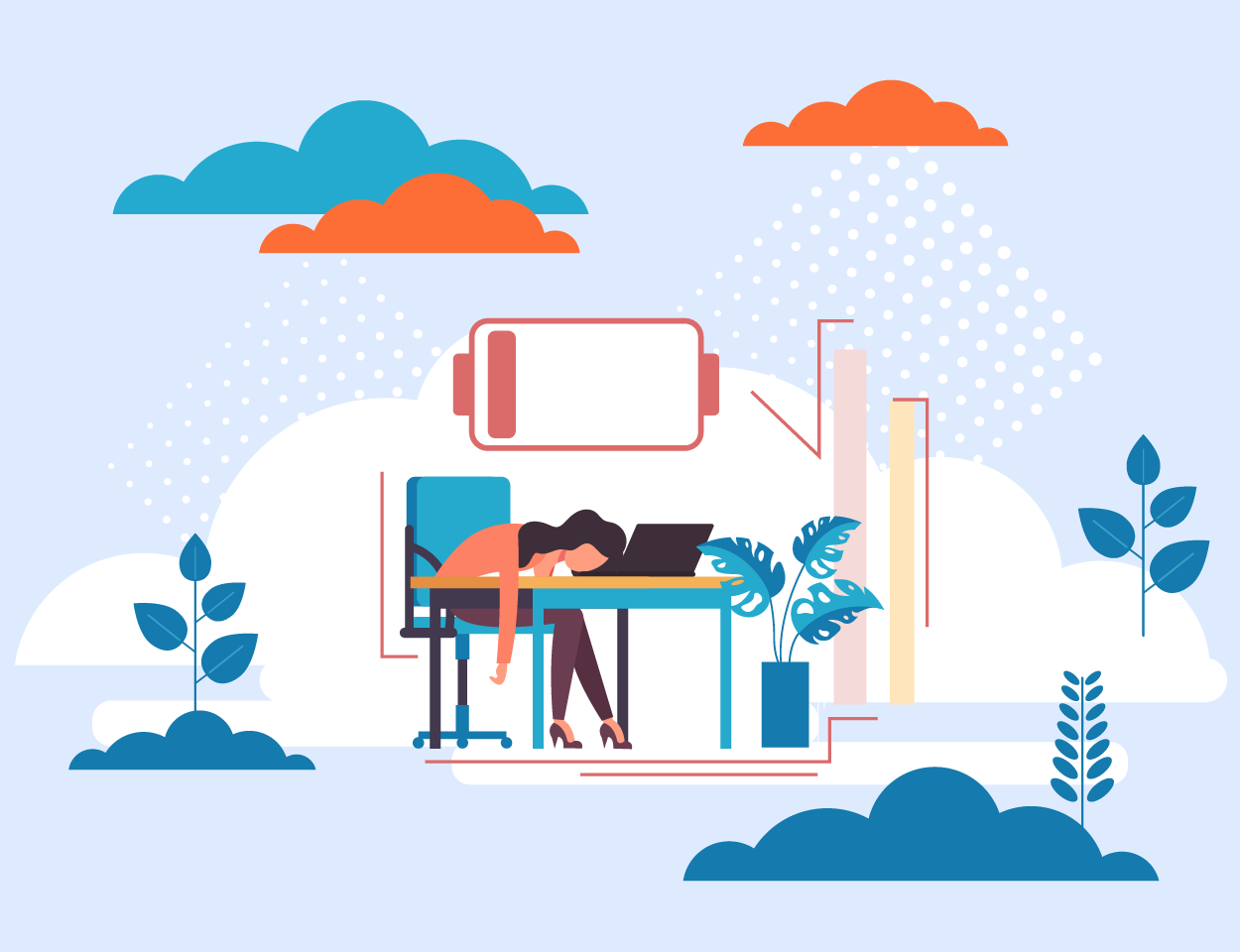
How long do you think a user is willing to stay on your site before abandoning it? 50% of users were found to hit refresh on a page if it takes more than 3 seconds to load. The Google recommendation for site load time is only 5 seconds or less, and only 15% of websites are this fast. Work with your site developer to make sure that your site loads quickly. By doing so, you can satisfy the human desire for instant gratification and keep users on your site
Users don’t read, they scan blocks of content
Break up copy with scannable headlines, subheads, bullets, and other visual assets. Think of how mobile news sites have developed their content. Most articles will include a relevant photo, catchy headline, scannable summary, and social buttons near the top for easy sharing. Then in the body of the article easily identifiable subheads break up short blocks of text. Assume that your reader is only going to scan your content, not sit down and read every word beginning to end.
Users like to share content – even when they don’t read it
In their studies, Sandstorm found that the less time users spend reading, the more likely they actually are to share it! Infographics and list-style articles are the most shared types of content, so don’t spend your time writing lengthy essays. Instead, focus on creating a catchy headline and include social sharing at the beginning of your content.
Users value consistency
Don’t try to get cute with your icons and buttons. Stick with established UX patterns for common tasks — a “+” symbol should mean add, a heart should mean a like, etc. Don’t try and reinvent the wheel, you don’t want to make your users solve riddles just to access content.
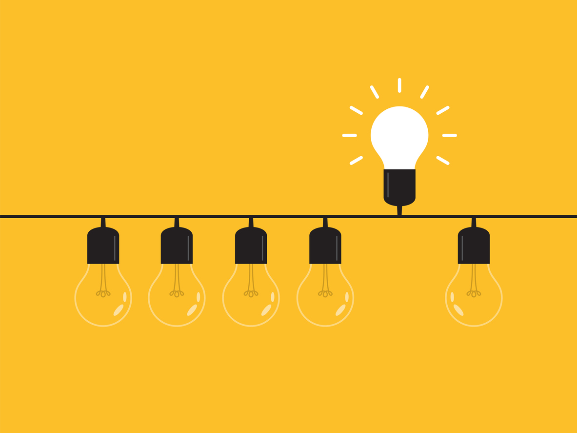
Users think your rotating homepage image is an ad
Users were found to not remember what was specifically on a homepage. However, if there was an automatically scrolling carousel, they remembered it as an ad and not association-created content. Static images and click-through slideshows are a little better to use, but the most successful solutions involved personalizing or prioritizing the content for the user. Deliver your main core message with quick ways to get to individual tasks.
Users will scroll on desktop when you give them a reason
The “fold” area right below a hero image or banner is the sweet spot of where users go to engage with content. Something as simple as “Scroll Down” or “See What’s New” text can pull your user into the bulk of your content on your homepage. Don’t get trapped creating a “false bottom” below your hero image/banner, artificially stopping your user from seeing content.
Many users struggle with color contrast
Sometimes, color alone is standing between you and good UX. Design with high color contrast in mind and consider working with your website developer to implement a high-contrast mode button on your site.
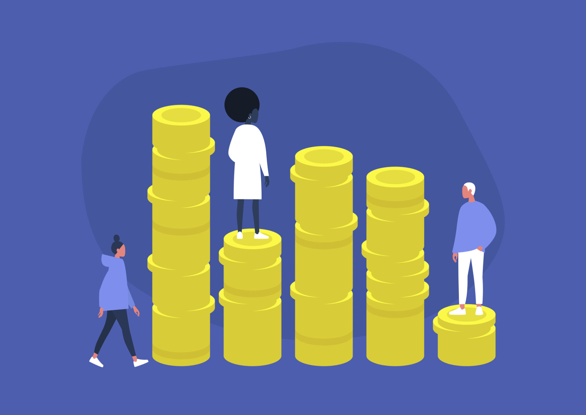
Users can tell when you prioritize your goals over theirs
If offering different pricing levels in a product or membership, users are quick to spot an attempt to push a higher-priced item. We normally read left-to-right as low price to high, so if you rearrange that order to push a more expensive option, users either get confused or think that you are trying to trick them. Transparency builds trust — don’t ever be deceptive.
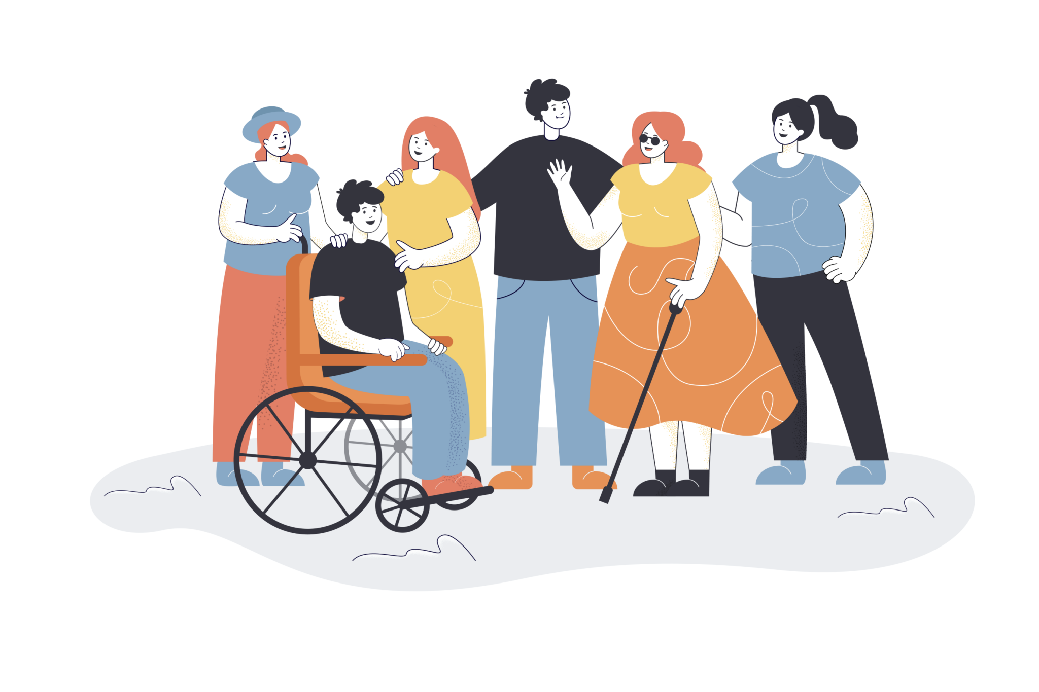
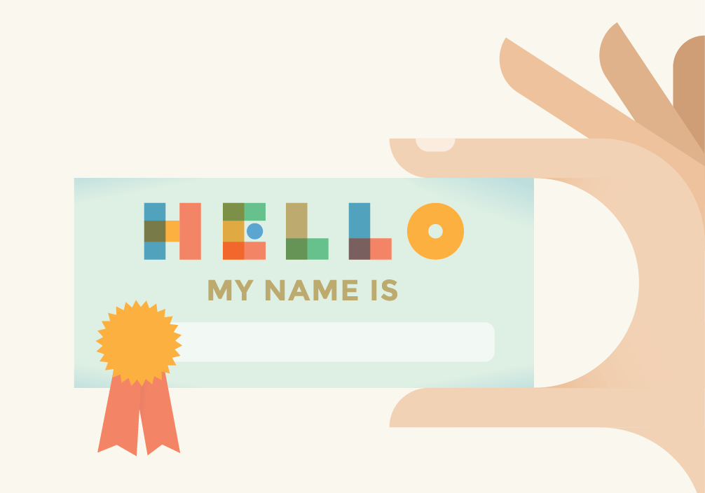
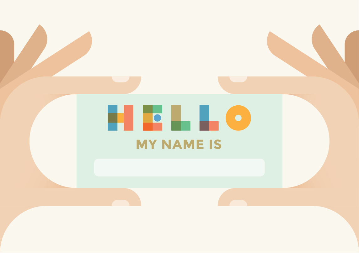
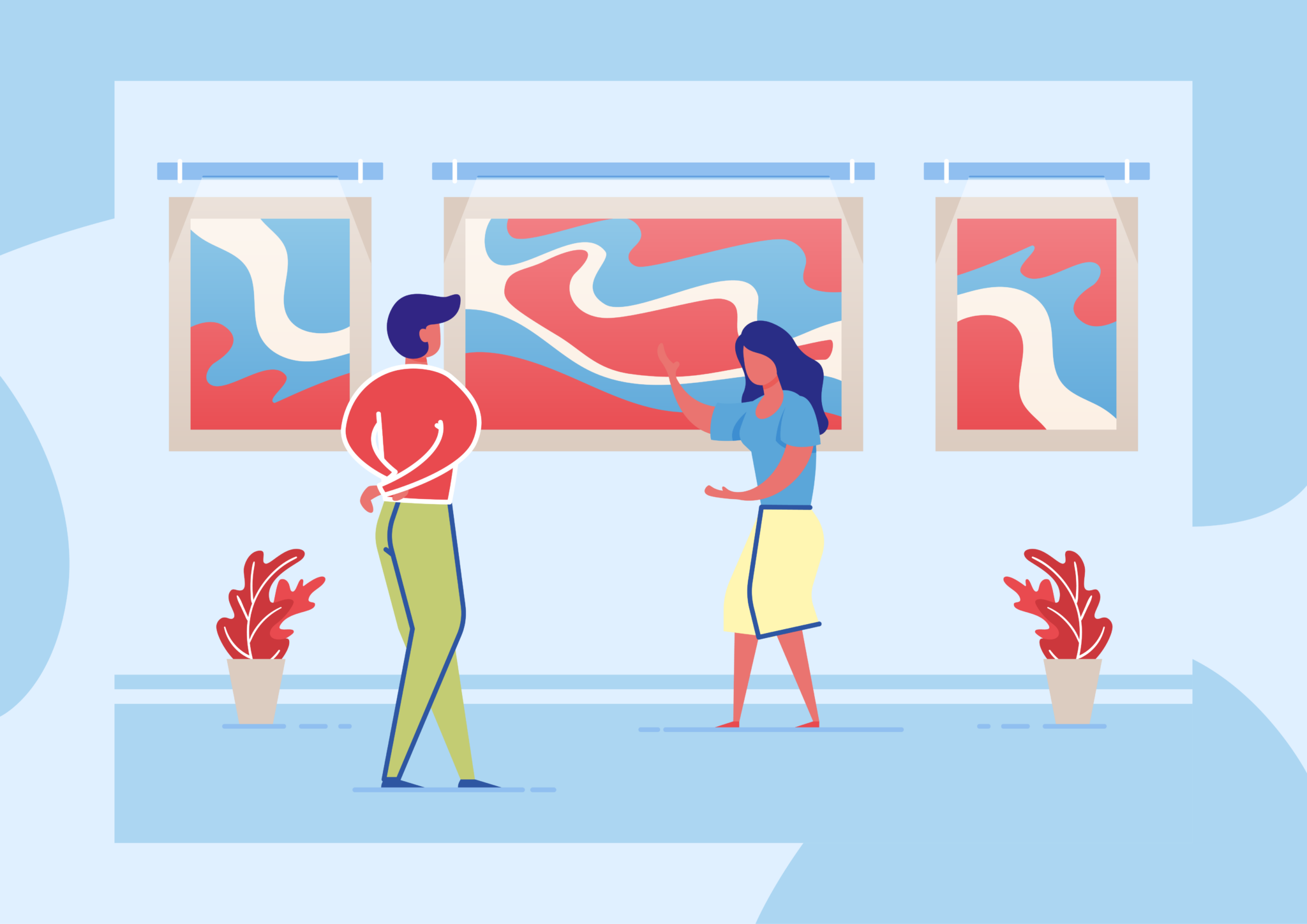
Users recognize stock photography as “fake” and often unrealistic
We recognize that stock photography or video is still necessary. There isn’t always the option to obtain your own original imagery with how quickly we need to create content. However, associations are about community, and your community will be quick to point out the things wrong with stock photos. Instead, show real people in your “membership”, “join”, and “about” sections. You don’t have to spend a ton of money hiring top-of-the-line photographers at events, just have a trusted member take photos on their phone. This is an opportunity to capture testimonial videos as well and capture quick content that is great for socials as well. Ultimately, users want to see real imagery that represents themselves.
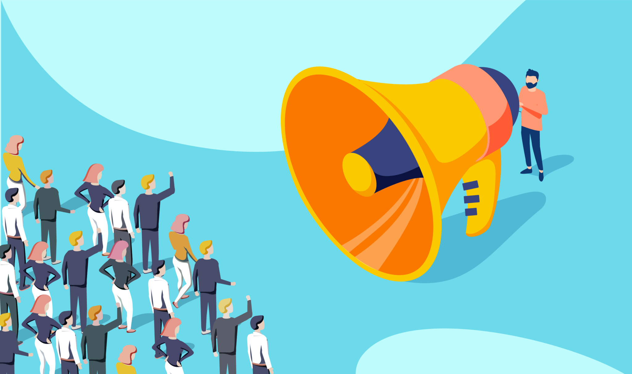
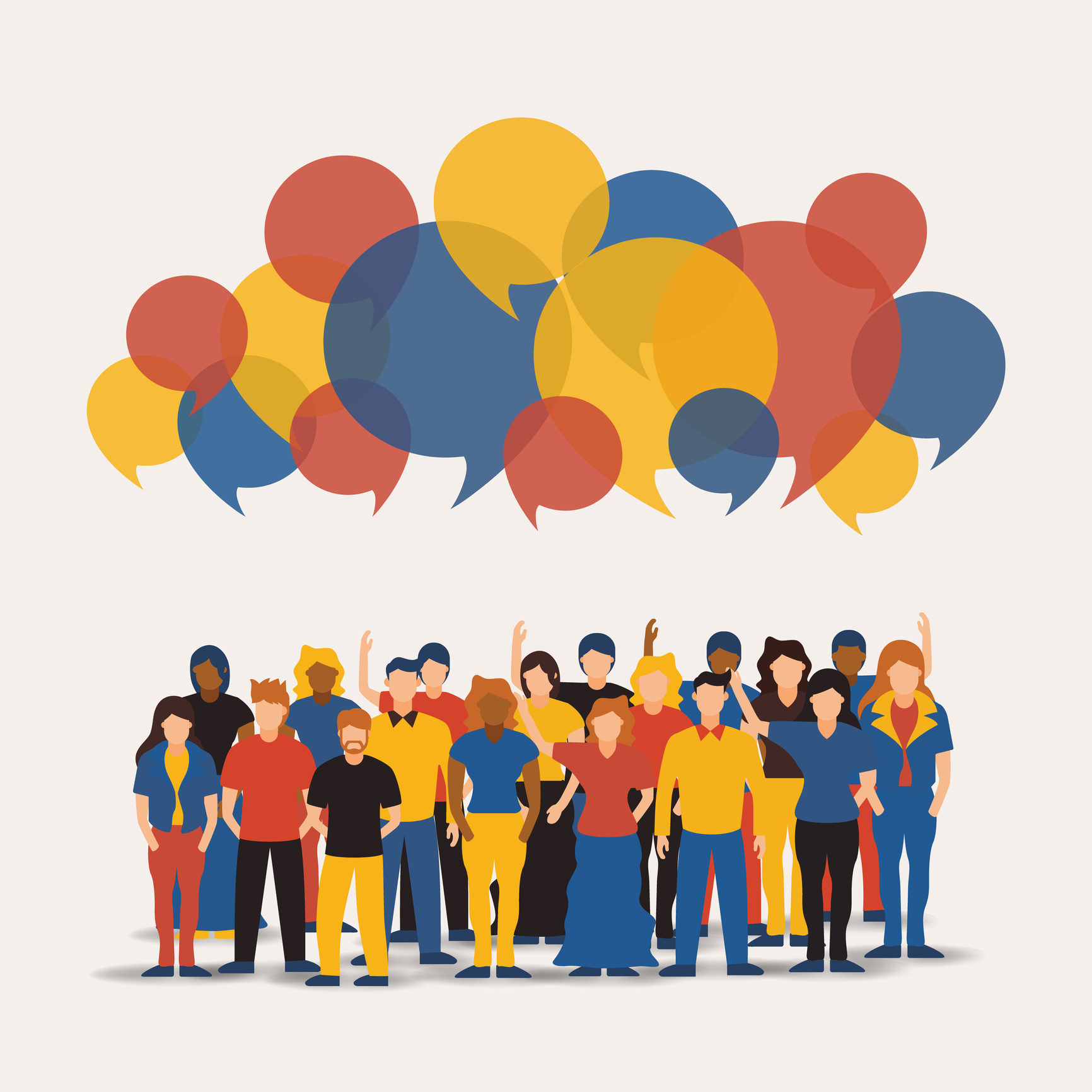
We’re all consumers — there is no business-to-business interaction in UX
There are still users on the other side of your B2B interaction, so why not design for them? Take the design tips that you use for your membership and apply it to your behind-the-scenes processes so that they still feel familiar. Don’t forget to look outside of your own industry to innovate and solve your UX problems. Something as simple as a Domino’s pizza tracker can be carried over to insurance claim statuses and reduce customer service calls.